
In a world where people spend several hours a day online, it is essential to have a web presence, but simply tacking up a website does not equate to successful business strategy. Travel-related businesses, in particular, must address a multitude of audiences (potential travelers, travel agents and buyers, and media representatives) while also organizing information strategically, highlighting content created and curated across a variety of platforms, and often guiding website visitors into the sales funnel. This is no simple task.
In August, Skift, a company that delivers research and insights about the travel industry, put out its annual list of the 25 best tourism board websites in the world. The article accompanying the list notes that the best destination websites have a modular design and streamlined navigation that not only makes the sites attractive but useful for those interested in researching or booking a trip. User-generated content and events are front and center on many of these websites, and mobile-friendly features are a must.
This list, according to Skift, “prioritizes websites with the best user experience overall, especially on mobile; the most modern modular layout, seamless navigation and impactful visuals, and the most nuanced multi-format storytelling.
“A fourth, more subjective criteria, involved how all of the above work together to make you want to go visit the destination, and more importantly, actually use the website to research the entire travel experience.”
Several Adventure Travel Trade Association (ATTA) destination members made Skift’s annual list. We reached out to representatives at three of the destinations — Bermuda Tourism Authority, Destination Canada, and Visit Greenland — who generously offered their insights into their destination’s website priorities, strategies, and advice.
ATTA: What are your destination’s key priorities when it comes to website design and navigation?
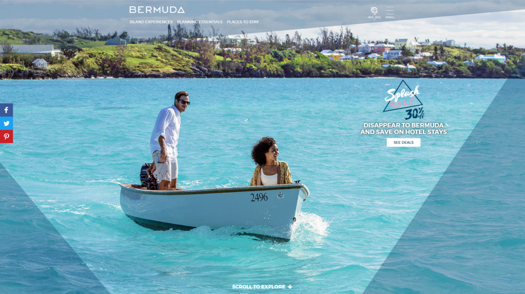
Bermuda Tourism Authority: In 2016, we launched a brand platform to introduce Bermuda to a new generation of travelers — the design and content strategy for our website was a vital part of that platform. Bermuda’s a small island set apart by its location out in the middle of the Atlantic Ocean and by its way of life. It’s also chock-a-block with storytellers and characters and a rugged beauty all its own. There wasn’t much content out on the web that really showed with any depth what active island life was like in Bermuda. So we treat the site as our hub to introduce visitors to the adventure, wit, characters, and genuine hospitality of Bermuda.
Engaging content is developed in an authentic voice, not only to inform, but also to inspire. And that includes video of cliff jumping, articles interviewing local guides, and even an adventure almanac that shows how adventure seekers can enjoy island life year-round. We take a mobile-first approach, so the site design is responsive of course, and really focused on improved navigation that was data-driven to improve the user experience.
Destination Canada: Destination Canada’s key priorities for website design and navigation were:
- Navigation that allows travelers to easily find experiences that interest them, even if they aren’t very familiar with Canada.
- Design for storytelling. Use imagery and video so that the traveler can build a mental model of what they could do in Canada.
- Keep mobile use in mind and design for quick use and simple browsing.
- Make it easier for travelers to plan.
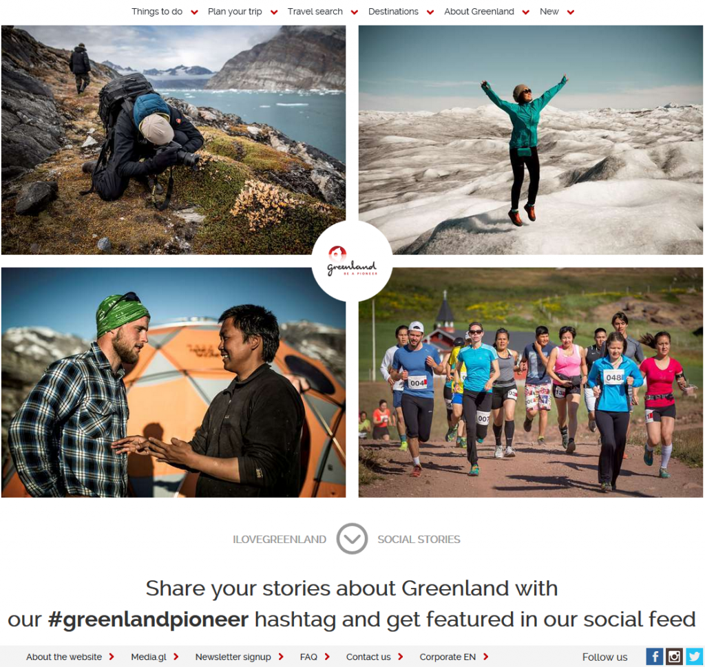
Visit Greenland: We are launching a new version of our main website in September that will focus around user experience and inspiration. Shortly after launch, ongoing optimization will focus on “being helpful” toward tourists; that is, help them find the answers they are looking for.
ATTA: What strategies does your organization use to draw visitors to its website?
Bermuda Tourism Authority: Almost every piece of content we create, including traditional public relations, influencer marketing, out-of-house, digital (email, display, social), magazine, and newspaper, connects to our website in some fashion. In addition, utilizing this integrated targeted and retargeting approach allows BTA to maximize reach due to geo-targeting Boston, New York, Washington DC, Chicago, Philadelphia, Toronto, and Atlanta.
We continue to refine our messaging based on data and research to a variety of targeted audiences. With this research, the goal is that the right person at the right moment utilizes the website in the right context to make their travel decision.
Destination Canada: Destination Canada uses a number of paid and organic strategies to drive people to the websites. We’re very passionate about social media, and we drive traffic to our site using both organic and paid posts on several social networks, including Facebook, Twitter, Pinterest, and Instagram.
We are also always working to hone our SEO, and we work with publishers, trade partners, and destination partners on content exchanges, syndication, and other mutually beneficial projects and programs that help drive traffic to all of our sites.
Visit Greenland: We are strong believers of search-engine positioning, and that's why we focus on acquiring our users through the Google search result pages by strengthening our pages with quality content. Other than that, we try to acquire users through our social media channels, as well as via inspirational emails that we send out to our subscribers. From time to time, we also use AdWords.
ATTA: What one piece of advice would you offer to other destinations that want to enhance their websites?
Bermuda Tourism Authority: Don’t be afraid to embrace the personality of the destination and utilize local personalities to tell your story.
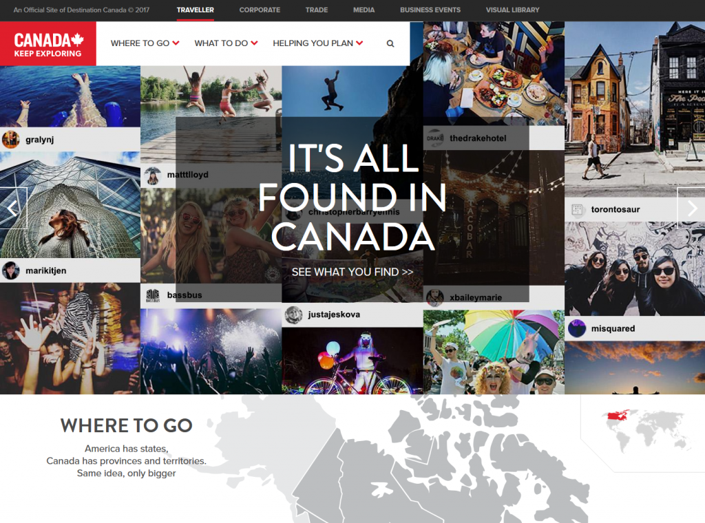
Destination Canada: Our biggest piece of advice is to put your target audience above all else when making decisions about what to do. We knew our audience was captivated by photos and imagery, so we made sure that images were prioritized in everything we did on the sites.
We also decided not to be a listings site; the consumer already has a lot of choice to go to for that information. As consumers ourselves, we believe that people appreciate being sent directly to the sources for the travel inspiration we highlight for them. We think this has really contributed to our site’s success, as is reflected in the number of leads we drive to our partners each day.
Visit Greenland: In times where “good enough” content is not good enough anymore, we try to put ourselves in our visitors' shoes and find the answers to the most important questions. How can our website:
- Fill their information gap about Greenland? (Being helpful.)
- Show all relevant value propositions in the most effective way? (Great user experience.)
- Make them fall in love with the idea of visiting Greenland? (For example, inspiring visuals.)